001 Design / Case Study
Digital Transformation of the EU Asylum Identity & Registration Platform
Client: Immigratie- en Naturalisatiedienst
Role: UX Lead
Deliverables: Multilingual RTL/LTR UI Architecture, Case-manager dashboard, WCAG 2.2 accessibility compliance, Tablet App Design
Redesigning the identity registration process for the Dutch Immigration and Naturalization Service, helping frontline staff meet new EU Migration Pact requirements while reducing intake processing time by 71%.
TL;DR
I led the UX for the Netherlands' new asylum identification and registration system, built to meet the EU Pact deadline of 12 June 2026. It replaced interpreter-mediated intake with a tablet application people complete themselves in their own language — cutting end-to-end turnaround by 71%, from about a week and a half to 72 hours. Live at Ter Apel in 10 languages, used daily by 220 IND staff, and set to serve as a reference implementation for other EU member states.

The Context
The EU Pact on Migration and Asylum came into force on 12 June 2026, requiring every member state to run faster, more consistent screening at the point of arrival. To meet it, the IND established a framework agreement valued at €5M to replace its legacy intake mechanisms entirely.
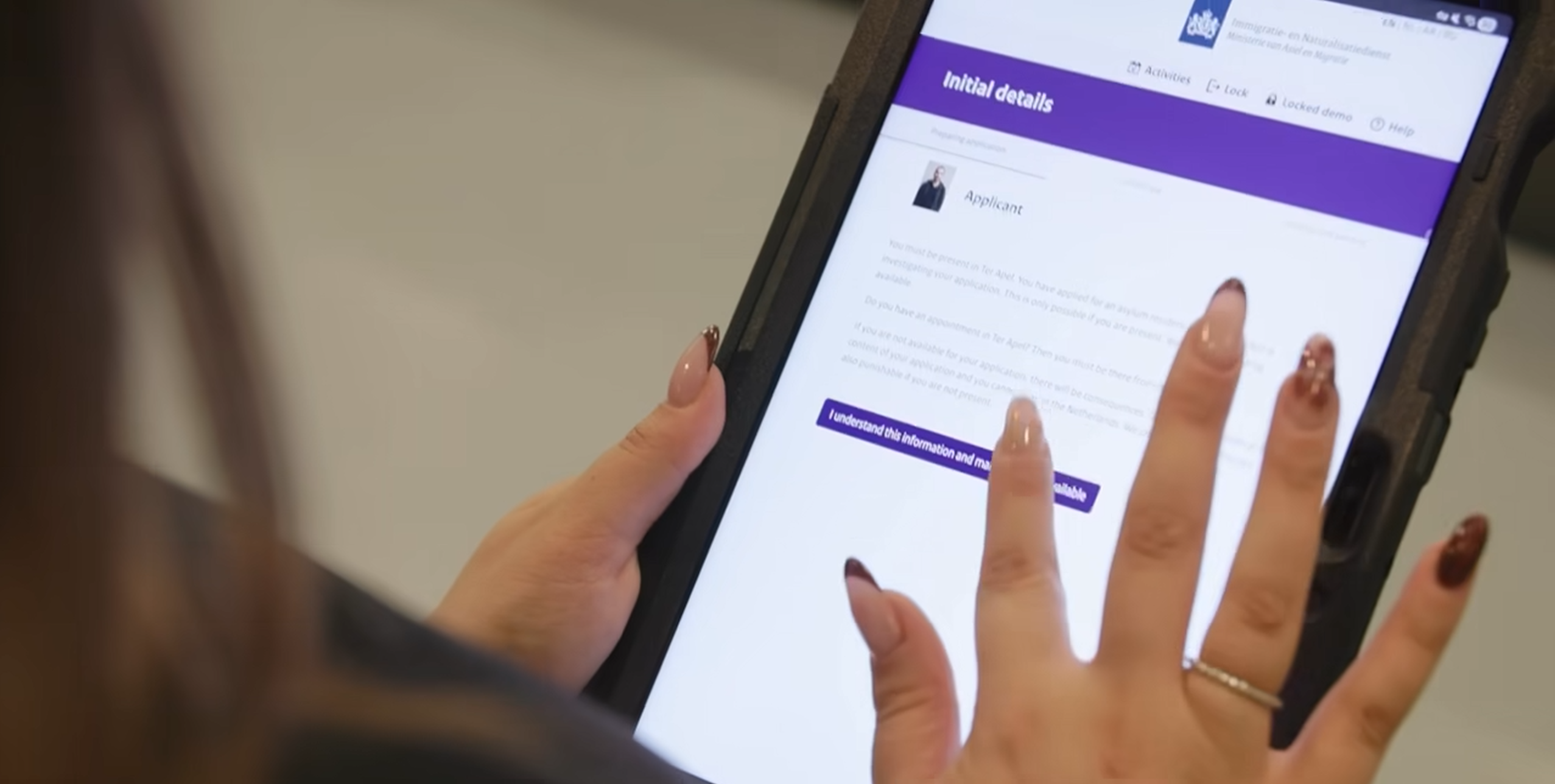
The existing process ran on manual hand-offs, paper, and legacy software, and had accumulated a backlog of more than 50,000 pending cases. Registration itself depended almost entirely on verbal exchange through interpreters; a slow, labour-intensive bottleneck that spread a single person's intake across multiple appointments over roughly a week and a half.
The people at the other end of that process are among the most vulnerable users any digital service encounters: first-time arrivals in an unfamiliar country, under acute stress, spanning the full range of digital literacy and with no shared language with the person in front of them.
The Challenge
The system had to work flawlessly in a high-volume, high-stress government environment, supporting roughly 30,000 asylum applications a year while reducing the standing backlog, and it had to do so under a hard statutory deadline.
Two constraints shaped every design decision:
- Cognitive load under duress. The interface would be used by people whose mental resources were already depleted. Anything non-essential on screen was a cost, not a feature.
- Language as the primary bottleneck. Interpreter-mediated data collection was the single largest source of delay. Reducing dependence on it was the throughput problem and the dignity problem at the same time.
The Approach
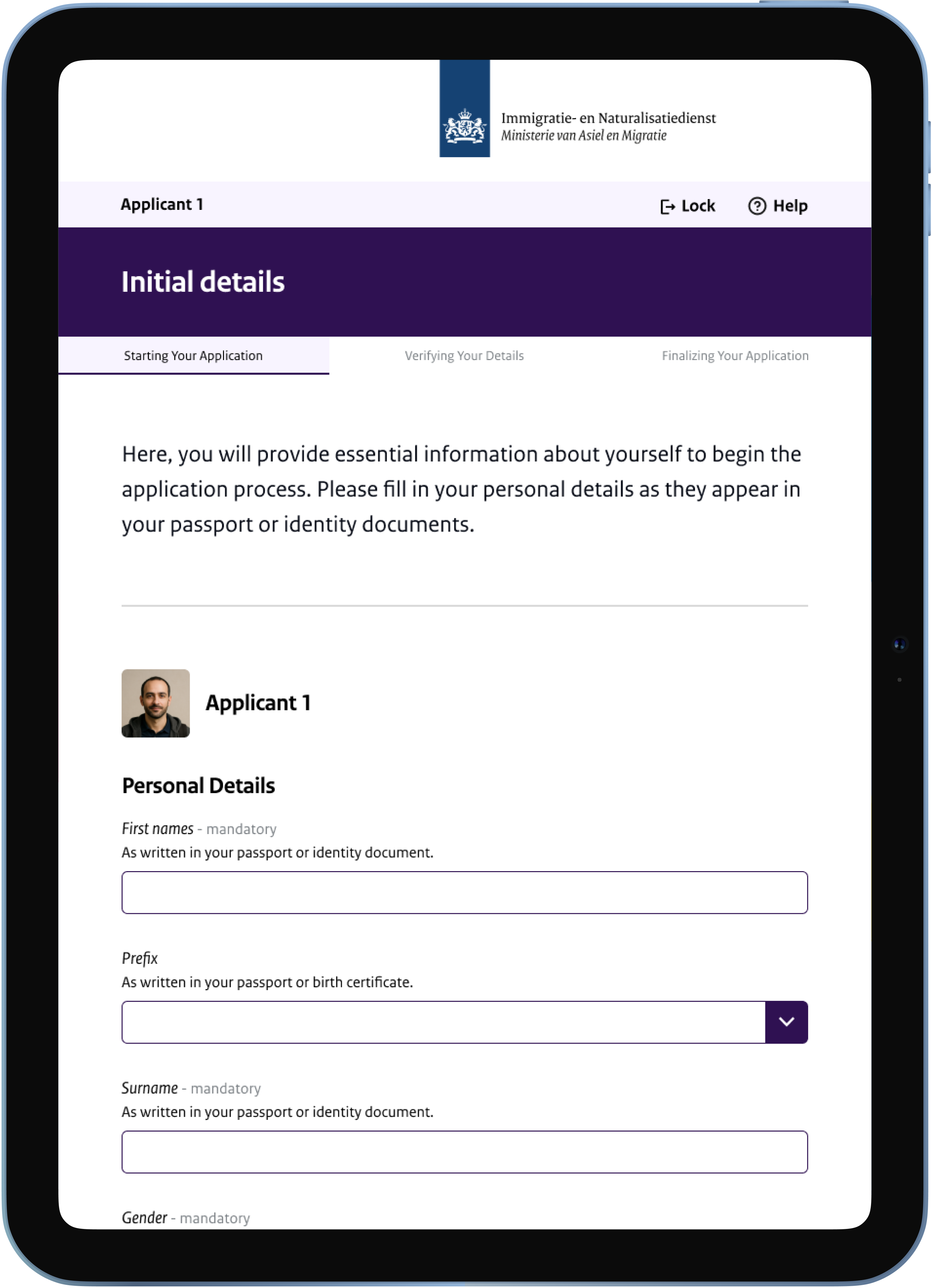
Shifting authorship to the applicant. The core move was to let people enter their own personal data on a tablet, in their own language, with an interpreter brought in only where genuinely needed rather than as the default channel for everything. This is what unlocked the time savings — but it also changed the character of the interaction. Someone reporting their own identity, rather than having it relayed through a third party, is in a materially different position. The efficiency gain and the trauma-informed goal turned out to be the same design decision.

Progressive disclosure and a wizard-driven flow. One decision per screen, no branching visible until it's relevant, no dead ends. Drawing on my background in neuropsychology, I designed the sequence around depleted working memory: short steps, unambiguous recovery paths, and no requirement to hold prior context in mind.
A scalable RTL/LTR architecture. Rather than treating right-to-left support as a localisation afterthought, I designed the frontend framework to handle bidirectional layout structurally — launching in 10 languages with the architecture built to scale past 20 without redesign.
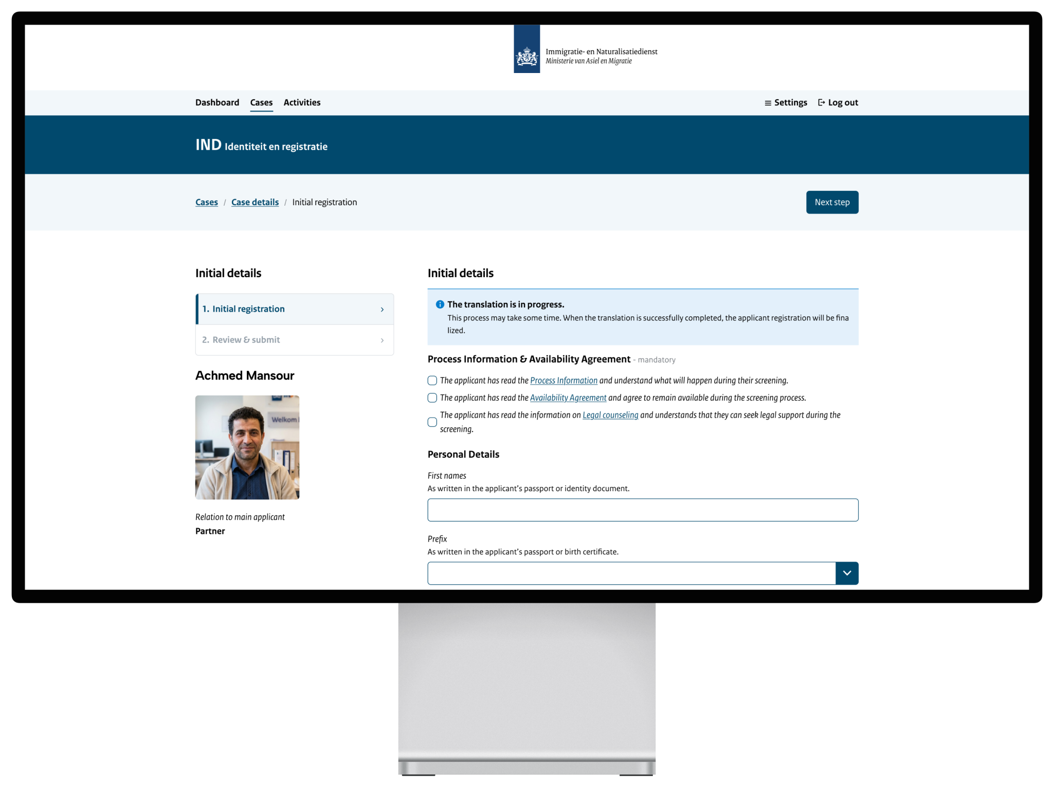
Design system and compliance. I worked within the IND Design System to guarantee WCAG 2.2 AA compliance under the EN 301 549 procurement framework, and contributed the new intake patterns back into the system for reuse.
Delivery under time pressure. To hit the deadline, I aligned the UX architecture with Netcompany's AMPLIO LENS platform, designing deliberately around reusable IT components so engineering could move at the required pace without the interface degrading into whatever the components happened to do by default.
Leading a team of designers and coordinating with the other design tracks on the programme, I owned the end-to-end design strategy for the identification and registration application.
The Outcome
The system went live at Ter Apel — the site where asylum seekers are registered on arrival in the Netherlands — in June 2026, meeting the EU Pact deadline. It is now in daily use by 220 IND employees.
End-to-end intake and registration dropped by 71%, from approximately 1.5 weeks to a maximum of 72 hours.
The registration session itself, previously spread across multiple appointments, now completes in a single three-hour sitting.
> "The same job is now handled very efficiently in three hours."
>
> — Anna Nijstad, IND Manager
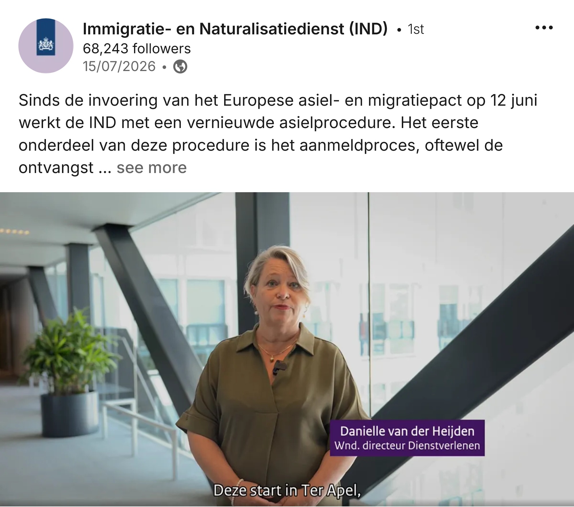
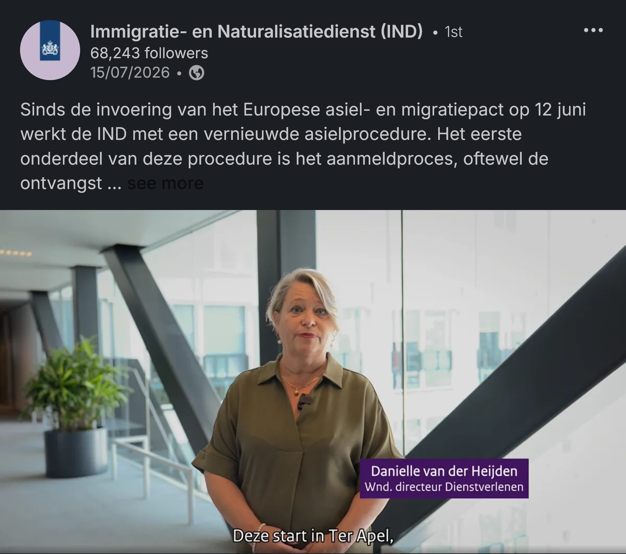
Beyond the throughput numbers, the change is qualitative: a faster, more consistent process for applicants, a substantially lighter load for IND staff, and a screening procedure that satisfies statutory EU timeframes. Every EU member state must revise its identification and registration process under the new Pact, and the Dutch solution is set to serve as a guiding example for other countries preparing to do so.
Lessons Learned
Designing for trauma means stripping away everything non-essential. Not simplifying for its own sake, but recognising that every optional element on screen draws down a resource the user does not have to spare.
The efficiency win and the dignity win were the same decision. The business case for this project was processing time. But the mechanism that delivered it — letting people enter their own information rather than routing it through an interpreter — was also the change that most improved the experience of being registered. I no longer assume those goals are in tension until I've checked.
Accessibility in GovTech extends well past WCAG. Compliance is the floor. The real work is psychological safety, reducing friction, and respecting the user's depleted mental state — none of which appears in a conformance report.
